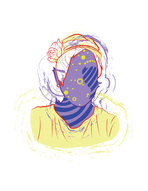
I tried following some of the suggestions for the 'cut out' style shape of color behind the sketches.
Thursday, March 2, 2017
Tuesday, February 28, 2017
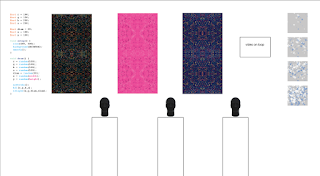
Possible layout for show
Not sure if I want to use pedestals or hooks yet for showing the headbands or scarves. I also am not sure if I want to show code for just one piece or all three. There will be a takeaway explaining the process so it may not be necessary.



Sketch Color Variations?
Tried putting some of them on a color background instead of just white. Not sure if it's too much, or if it works. Just something I'm trying out!
Also tried a few with white behind the sketch, but in front of the background color as well. Again, not sure if it's too much, or if it works, but wanted to try it out.
Also tried a few with white behind the sketch, but in front of the background color as well. Again, not sure if it's too much, or if it works, but wanted to try it out.
More Updated Sketches!
Hey there, here's some more of my updated sketches!
(Still need to work on adding the feet in on this one, but I tried to fix the head, some hands, and such)
(Also, still need to make these into AR experiences as well! I'm having a bit of trouble making a few things work, but hopefully will have them figured out soon!)
(Also, still need to make these into AR experiences as well! I'm having a bit of trouble making a few things work, but hopefully will have them figured out soon!)
Monday, February 27, 2017
Show Invitations
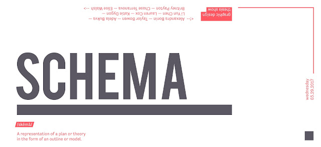
Here is a mock up of what we were thinking for the invitation. The title will be set in wood type and the rest of the content will either be set or we will use a polymer plate (depending on the quality). We still need to add a time for the show which will go along the side with the date.
We can discuss further color options and paper color so that can be ordered ASAP.
The design was inspired by a blue print, and we wanted it to be portrayed in a modern and simplistic way. We will also explore other solutions when we continue to work in the letterpress room this week...
Chase made a good suggestion of having something on the bottom half of the page, facing the same way as our names so it ties in with how the card will read. This will help with legibility and will move the viewers eye faster to the top of the page.

Updates
I've finished scanning and pulling all my thumbnails now.
Subscribe to:
Comments (Atom)


